Seller Central's reports are rigid. Tableau lets you build interactive dashboards that answer questions Amazon won't. Learn connection setup, 7 essential visualizations, calculated fields, and dashboard templates used by top sellers.
Seller Central's built-in reports are rigid. Tableau lets you build interactive dashboards that answer the questions Amazon won't. Connect your BigQuery or Snowflake data, and you have unlimited visualization power for Amazon analytics. For a full inventory of what those native exports do and don't cover, see our amazon seller central reports reference. This guide covers connection setup, visualization best practices, and dashboard templates used by top Amazon sellers. Use these metrics for a weekly operating review.
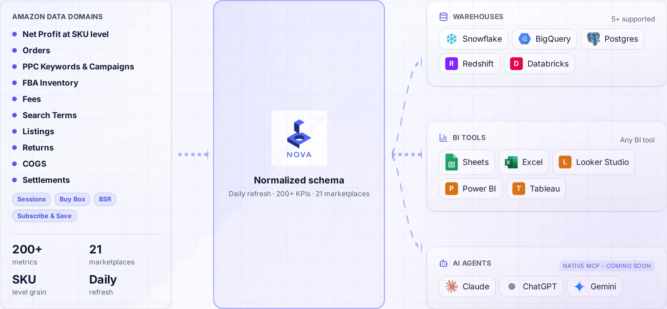
A normalized schema connects Amazon data to the warehouses and tools your team uses.
The sellers who outperform aren't looking at more data. They're looking at the right data, visualized correctly. A well-designed Tableau dashboard turns 30 minutes of spreadsheet analysis into 30 seconds of visual insight.
This guide assumes you already have Amazon data in BigQuery or Snowflake. If not, start with our BigQuery guide or Snowflake guide first.
Why Tableau for Amazon Analytics
Tableau has become the gold standard for data visualization in enterprise environments. For Amazon sellers managing complex portfolios, Tableau offers capabilities Seller Central can't match:
Interactive Exploration
Click, filter, and drill down into any metric. Find answers to questions you didn't know to ask when you started.
Cross-Source Analysis
Combine Amazon data with Shopify sales, Google Ads spend, and warehouse inventory in a single view.
Calculated Fields
Create custom KPIs on the fly. Build contribution margin, TACoS, and unit economics without touching SQL.
Scheduled Alerts
Get notified when metrics cross thresholds. Know immediately when ACoS spikes or inventory runs low.
The sellers getting the most from Tableau aren't building prettier reports. They're building decision systems that surface problems before they become expensive.
Connecting Tableau to Your Amazon Data
Tableau connects natively to both BigQuery and Snowflake. The setup takes about 10 minutes:
Connecting to BigQuery
Install the driver: Download the Simba ODBC driver for BigQuery from Google Cloud
Create service account: in Google Cloud Console, create a service account with BigQuery Data Viewer role
Download credentials: Export the JSON key file for authentication
Connect in Tableau: Select Google BigQuery, upload your JSON key, and choose your project/dataset
Connecting to Snowflake
Get connection details: Account identifier, warehouse, database, and schema from Snowflake
Set up user: Create a dedicated Tableau user with appropriate role permissions
Connect in Tableau: Select Snowflake, enter your account URL, and authenticate
Choose warehouse: Select the compute warehouse for query execution
Pro Tip: Use Extracts for Speed
For large Amazon datasets, create Tableau extracts instead of live connections. Extracts are optimized for Tableau's engine and load dashboards 5-10x faster. Schedule extract refreshes to match your data pipeline (Nova streams orders and units in real time; other reports follow Amazon's schedule).
Dashboard Hierarchy: From Overview to Detail
The best Amazon Tableau dashboards follow a three-level hierarchy. Each level answers different questions at different cadences:
Level 1: Executive Summary
Audience: Leadership, investors
Cadence: Weekly/Monthly
Focus: Revenue, profit, growth trends
Level 2: Operational
Audience: Managers, analysts
Cadence: Daily
Focus: PPC performance, inventory, issues
Level 3: Diagnostic
Audience: Specialists
Cadence: on-demand
Focus: SKU-level analysis, root cause
Most sellers make the mistake of building one massive dashboard. This overwhelms users and hides important signals. Build separate dashboards for each level, linked together for drill-down.
7 Essential Amazon Visualizations
After analyzing hundreds of Amazon Tableau dashboards, these seven visualizations deliver the most actionable insights:
1. Revenue & Profit Trend (Dual-Axis Line)
The foundation of any Amazon dashboard. Shows revenue and profit on the same chart to reveal margin compression early.
How to Build
X-axis: Date (day, week, or month)
Y-axis left: SUM(Revenue)
Y-axis right: SUM(Net Profit)
Color: Revenue in blue, Profit in green
Add reference line: Zero line on profit axis to spot loss periods
2. TACoS Gauge with Trend
TACoS (Total Advertising Cost of Sale) is the single best indicator of advertising efficiency relative to total business health.
Tableau's Level of Detail (LOD) expressions are powerful for Amazon analytics. Use FIXED to calculate metrics at specific granularities regardless of the view. Example: {FIXED [SKU]: SUM([Revenue])} calculates total revenue per SKU even when the view shows daily data.
Dashboard Templates
Here are three dashboard templates used by successful Amazon sellers:
Template 1: Daily Operations Dashboard
Section
Visualizations
Purpose
Top KPIs
4 BANs: Revenue, Orders, ACoS, Profit
Quick health check
Sales Trend
14-day line chart with YoY comparison
Trend identification
Top Movers
Bar charts: Top 5 gainers/losers
Immediate attention items
Inventory Alerts
Table with conditional formatting
Stockout prevention
Template 2: Weekly P&L Review
Section
Visualizations
Purpose
P&L Summary
Waterfall: Revenue to Net Profit
Margin analysis
Fee Breakdown
Stacked bar by fee type
Cost driver identification
Product Matrix
Scatter plot: Revenue vs Margin
Portfolio optimization
WoW Change
Comparison table with arrows
Performance tracking
Template 3: PPC Command Center
Section
Visualizations
Purpose
Spend Overview
Donut: Spend by campaign type
Budget allocation
Performance
Bubble: Campaigns by ACoS/Sales
Efficiency analysis
TACoS Trend
Line: 90-day TACoS with target
Long-term health
Keyword Table
Top/bottom performers with metrics
Optimization opportunities
Visualization Best Practices
Follow these principles to build dashboards that drive action:
Do
Use consistent colors across all dashboards
Put the most important metrics top-left
Include date context on every view
Add comparison periods (WoW, MoM, YoY)
Use tooltips for additional context
Design for the decision, not the data
Test on actual screen sizes used by viewers
Don't
Cram 20 charts on one dashboard
Use 3D charts (ever)
Mix chart types randomly
Forget mobile/tablet viewing
Hide important filters
Use red/green only (colorblind users)
Build without knowing the audience
The 5-Second Rule
A well-designed dashboard should answer "How are we doing?" within 5 seconds. If users need to study charts to understand the current state, the dashboard needs simplification.
Getting Started: Your Next Steps
1
Get Data Ready
Connect Amazon data to BigQuery or Snowflake using Nova's pre-built pipeline.
2
Connect Tableau
Set up the native connector with proper authentication and extract scheduling.
3
Build First Dashboard
Start with the Daily Operations template. Iterate based on team feedback.
Skip the Data Pipeline Complexity
Nova delivers all Amazon data points to BigQuery or Snowflake with orders and units arriving in real time. Your Tableau dashboards stay current without building or maintaining data pipelines. Explore Nova's API for data teams and agencies.